

Portfolio / Graphic Design
Logo Development
The key to logo development is simplicity.
One message, One graphic, One second.
Pure communication made visible.
From my home studio I have had the privilege to work with a number of aspiring business ventures on their number one communication piece, the Logo. Each Logo has been created through Client – Developer interactions, thus allowing for their vision to reflect the graphic.
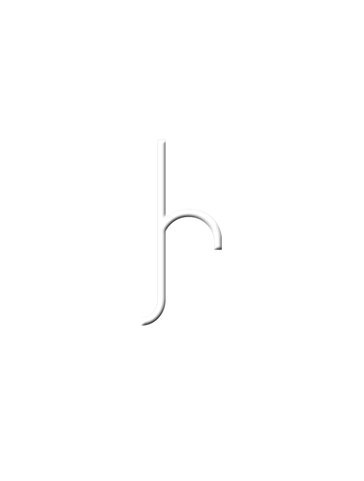
I see each logo as a range of critical components, the first being size relevant. Whether the most regular inclusion is upon a letterhead or a large billboard, size adaptability changes design outlays. Colour is then factored into the proceedings, and only if the client deems it necessary. Too many colours detract from the message and improves its versatility once being introduced to professional printers. This monochromatic approach shows a level of sophistication and refinement that most don’t achieve.
I feel it’s my responsibility to create a Logo that can be the proud face of the business or organisation, in which can inspire work productivity and industry growth.
My Ideas & Solutions
For aspiring business ventures
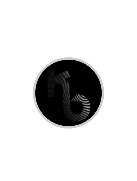
The Logos shown are but a few of the many that I have been responsible for. Above we have a combination of two extremes. The first Logo reflecting one man’s vision to impact the heart of his city. This man is an aspiring pastor for his local church and the logo directs his iconic focus upon his heart vision. The second is a production company involved with recording musical ventures. This is a small business with a focus on capturing the musical flares of bands and individuals. The Logo holds the name in an iconic format with the message of music recordings with its border and mouth like geometric triangle. Future explorations may take the business into the media industry, and this graphic would also explain through a movie ‘take’ snap board.
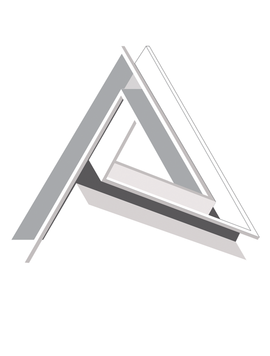
The next Logo, and Logo dear to me, is my ‘Architect’ Logo. This is found within my apparel range, but describes my unique vision for my own career as both an Architect and Graphic Designer. The lines forming a three dimensional ‘A’ never meet. What you think is a side face turns into a top face for another element. Once again monochrome colouring allows for the sophistication of lines to communicate a lasting impression upon the onlooker.
The last set are once again unique individuals with business ventures both musically and artistically. Both communicate a strong message and will maintain relevance towards any future expansions.
Recent Portfolios

Industries Apparel

Logo Development

Environmental Science
